In mid 2015, I joined the media company Prisma Media. Hired as a product designer, I helped the company envisioned an innovative experience using machine learning and smart technology. I worked on the project from problem definition to the final design of the iOS and Android application.
After I left, the application was rebranded and named Infonity.
Product designer
July 2015 – Sept 2015
Concept, iOS, Android applications
Over the year 2015, Prisma Media started an innovation project to envision how smart technology and machine learning would provide a new experience for its readers.
While Prisma Media offers different type of premium content (long form, articles, video, TV program, recipes, etc.) to over 20 millions readers per months, they are all spread across many digital services. For the first time, the company wanted to abstract its brands and focus on the content to provide a meaningful user experience through a mobile application.
During the spring and summer of 2015, I joined a team of 10 stakeholders hand-picked across the company. I had the chance to own the design and product vision from the very start to the V1 of the product, under the supervision of the head of digital design.
In the first week, I ran a series of design thinking plays to forge the core concept of what we were building. Then, during my remaining time in the company, I collaborated with other designers to build the user interface and design language of the first version of the application.
In April 2016, 8 months following the end of my contract with Prisma Media, the application I envisioned was rebranded and renamed Infonity before being released to the market and downloaded more than 70 000 times.

On the first day, the head of digital design gave me the following explanation:
"We want to build a new type of experience to consume daily news.
We want something that adapt to the user, like a personal assistant.
Each articles will be in 3 format: text, video and audio."
He asked me to start on my own for two days straight to kick off the work and present him various concept of the application.
Contextualisation and smart were the key components of the product.
As a strong believer of design being the solution to a problem, I wanted to formulate the right question before working on an answer.
The first step of my 2 days sprint was a mind-map to extract my initial thoughts into a visual diagram that outlines the many sides of the project.

Representation of the possible format the content could take and all the news categories of Prisma Media brands. Some content are more complex than other such as Tv program, recipe or shopping services.
Users conditions that would generate different user case and enable a meaningful usage of contextualisation. Listed by devices activities and geolocation.
Interesting applications inspiration like: Yo brought a new way to receive news. Luka or Lark, were some of the first conversational UI launched in the western market.
With those informations categorised, I had a clearer sight of the global area and asked myself:
“How do I access the news today?
Why would I need a smart news application for?”
To answer my questions, I captured a short user story into an abstract step by step flow where I was able to figure out a first series of pain point a user can encounter when looking for news.
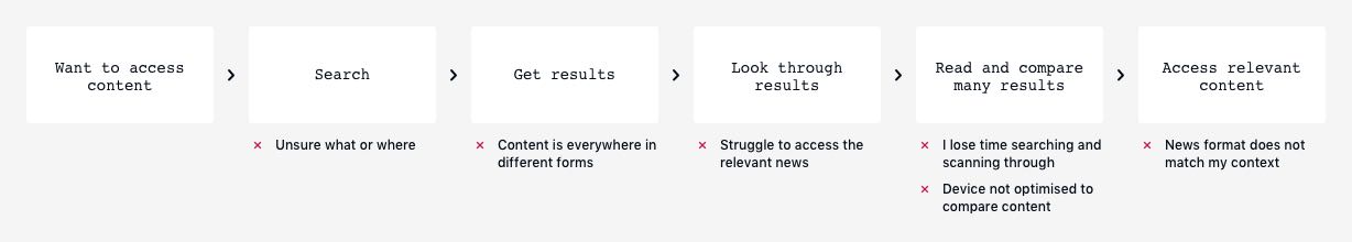
From this short exercise, it seemed quite obvious that the biggest frustrations a user would encounter could come from:
At this point, I started to have interesting material to work with and was able to connect the problematics to the map to start forming the first concepts.
However, the project was still very abstract and disconnected from real-life experience. To make it more tangible, I created three user stories, based on my friends, family and personal experiences, to challenge my first set of problems and identify more concrete ones.
Because I did not have the resources for, I could not perform actual user research. But, given the early stage of the project, I needed something to build my first hypothesis and those stories were sufficient.
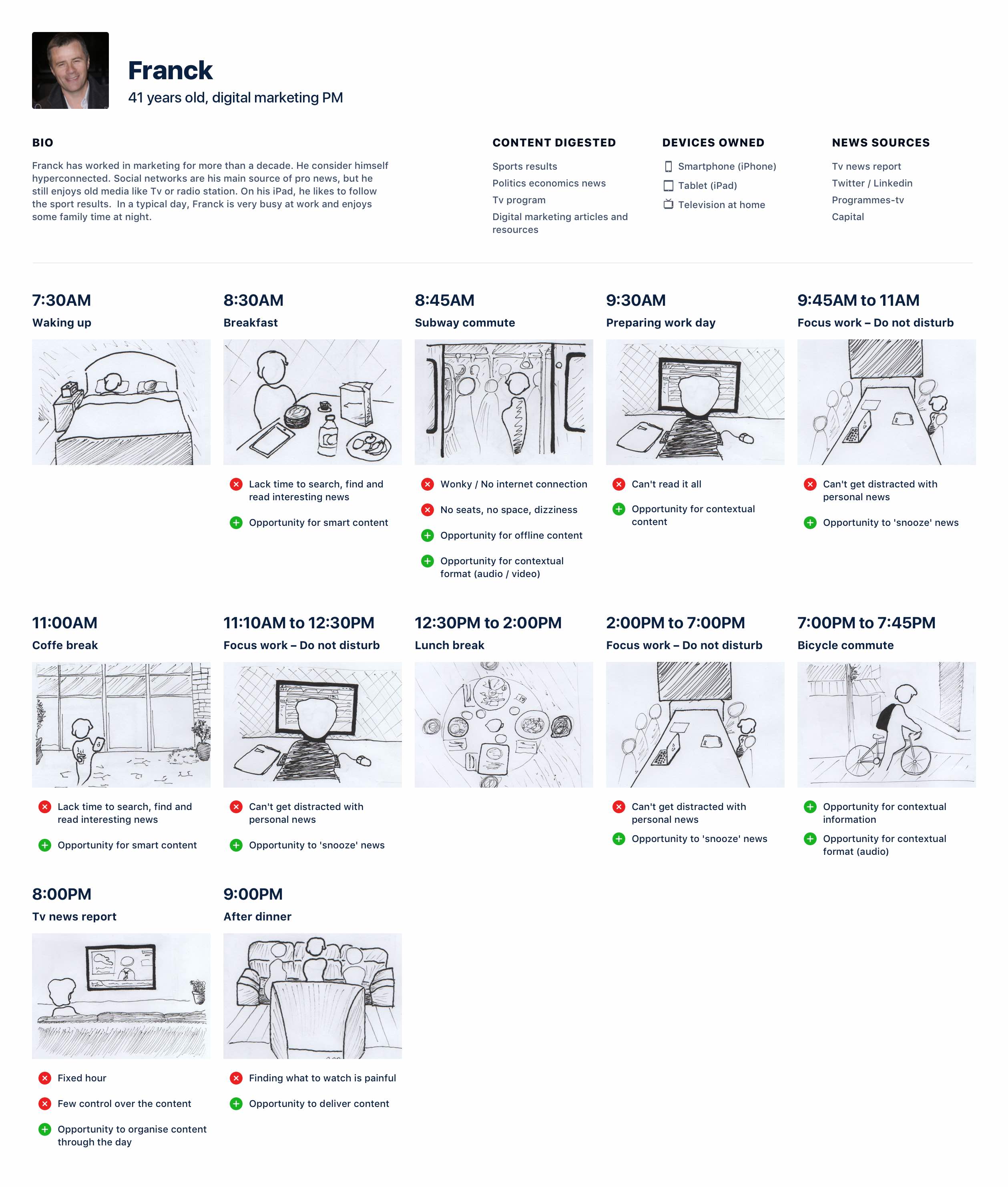
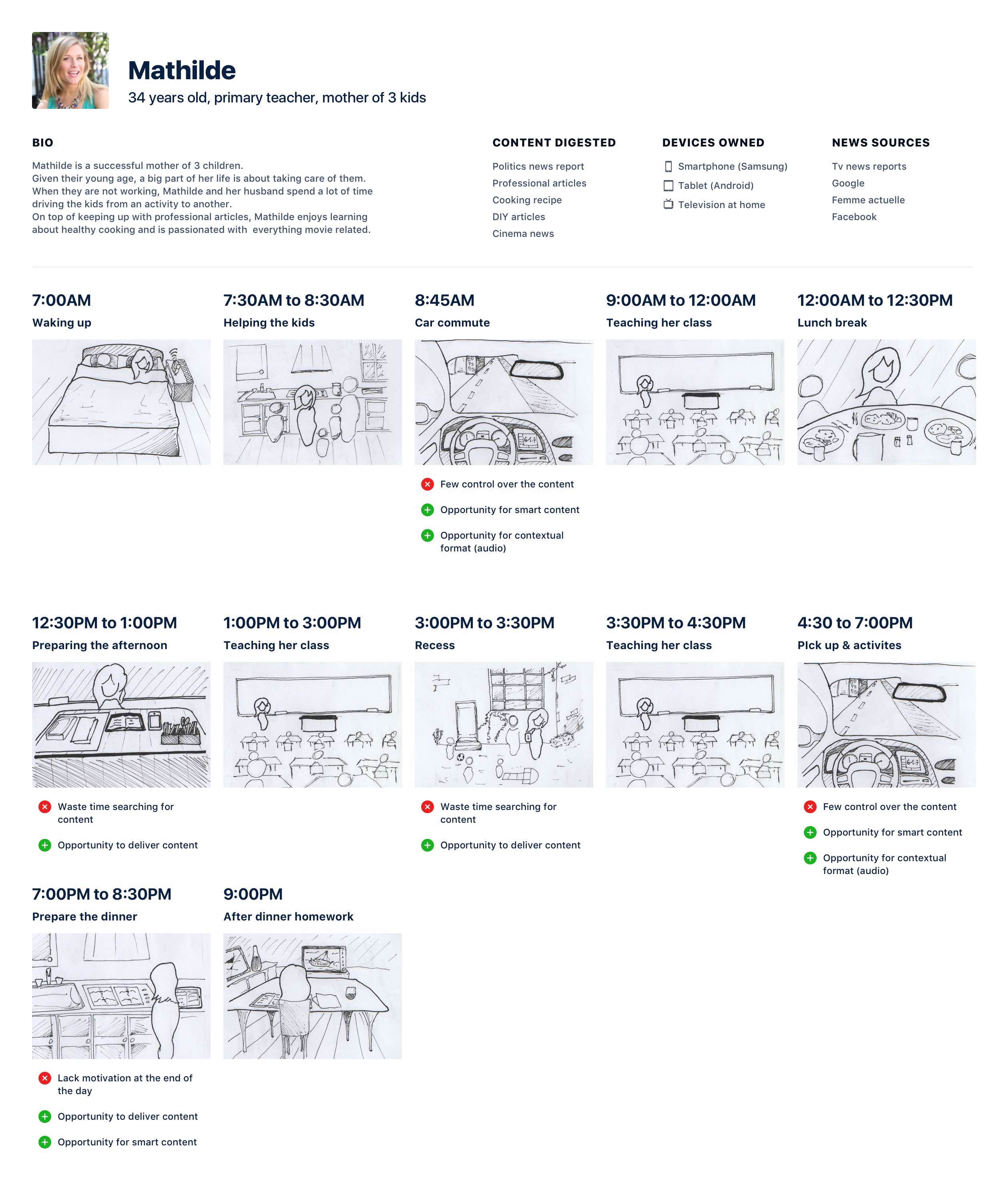
The stories of my 3 characters’ life raised interesting and similar frustration along their day that our service could help with.

Content segmentation
My personae alternated between a perso and pro context.
They both ask for different news categories and a well traced limitation between one another.
Contextualisation solve this needs by enabling a smarter organisation of the content.

Time and content management
They all had dedicated moments in the day to catch up on the news.
However, when in the wrong place or without too much time, finding the right news in the right form becomes quite painful.
Smart technology could learn from a user daily habits to offer optimised format and bring the right content straight away.

Avoid information overload
Two of the personae found themselves overwhelmed with information due to their inability to follow up along the day and as a symptom of the previous pain points they experienced.
Smart technologies could help better lay out the content throughout the day, being proactive and delivering the relevant pieces of news at appropriate time of the day.
Synthesis
In our hyperconnected society, content is everywhere, from email newsletter to social network, specialised websites, forum or indie blogs.
New information is being created everyday and can be accessed by anyone having a device connected to the internet. But, no service allows to find the right amount of content of the relevant news in the right form at the right time.
How can smart technology learn from our habits to enable a better organisation of the information, customised to our context?
The goal of our product is to provide a modern way to consume daily news that will:
#1
Reduce the time to find relevant content
#2
Personalize content to my interests
#3
Optimised the amount of content
#4
Adapt content format to my habits
The core of the application revolved around two axes: access the right information / read and digest the content.
Inspired by my previous work, I imagined multiple mechanisms to solve my user's pain points with machine learning.
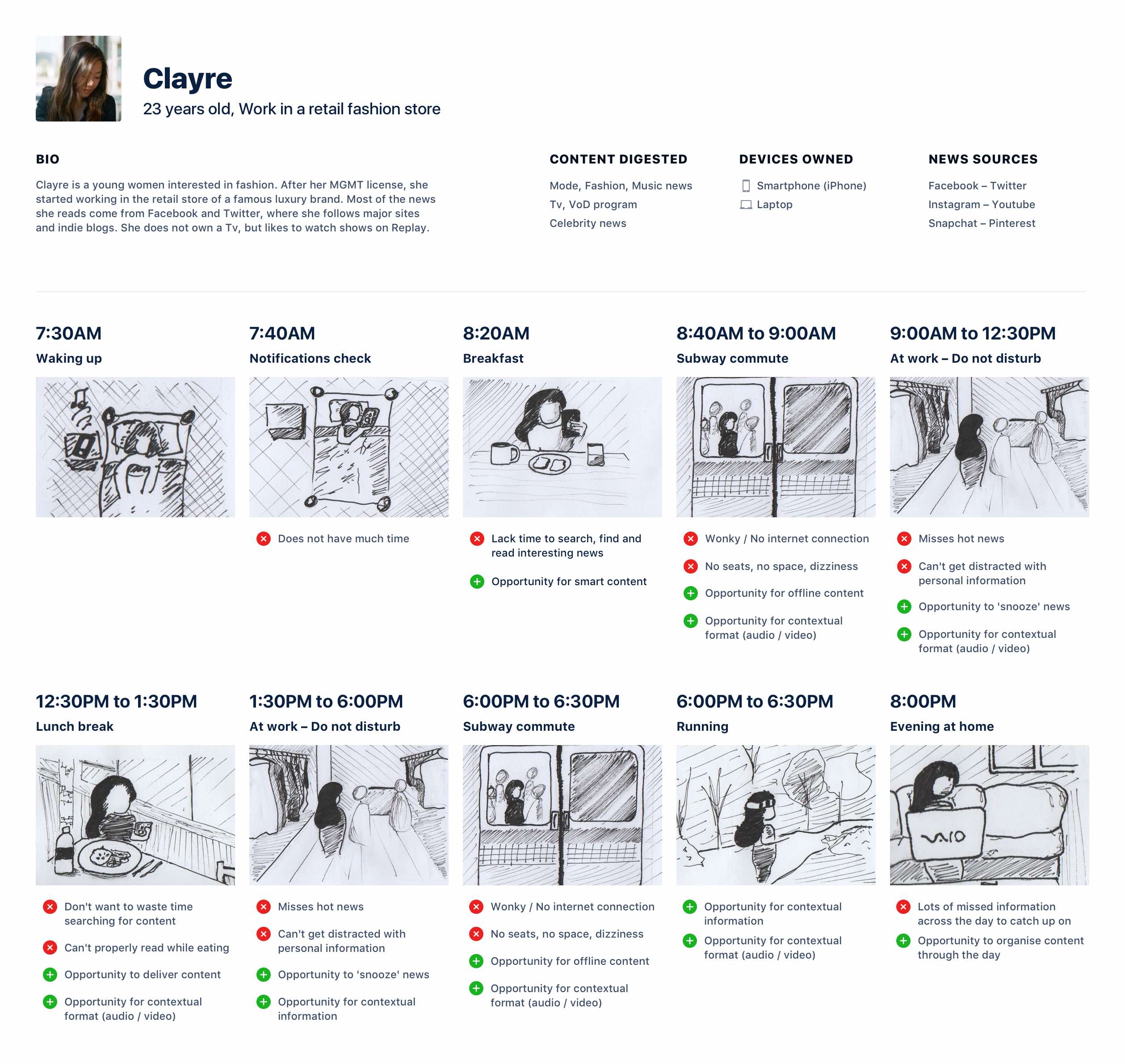
The first exploration took a user driven input approach.
The product is a search engine disguised as a chatbot UI. The user ask for content, the machine offer an answer and start to learn the user habits. Up to a point where the bot will propose content on its own.
This concept is solving for the personae who would not have time to search and compare content.
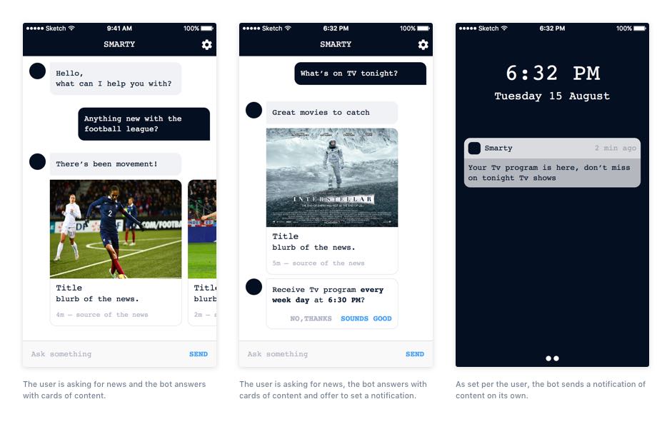
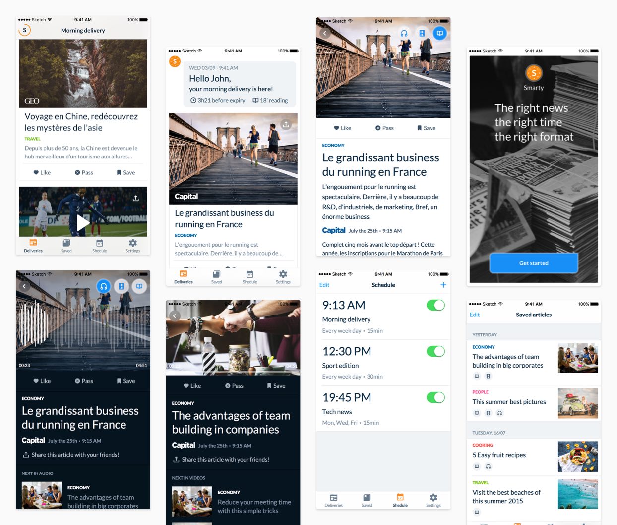
Main screens of the first concept: a chatbot UI.
The second concept was envisioned as machine driven input.
Starting with an alarm view, the user set a series of content deliveries across the week. The machine will push content at recurring time and optimised all the parameters based on the user’s interactions.
This concept help better organised content across the day by choosing when to receive burst of daily news and then rely on the machine to optimised it for the user, while keeping total control.
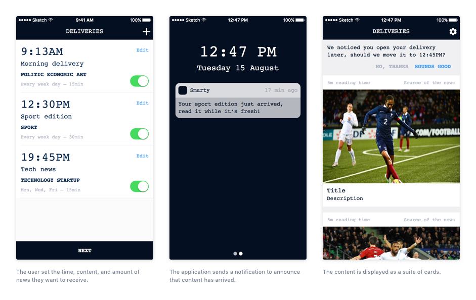
Main screens of the second concept: a news alarm.
The third concept is a more familiar user interface that mixes a search bar and leverage cards element.
On first uses, the product suggest a feed of content sorted by categories while the search bar allows deep filtering.
The machine learning is much more hidden to the eyes and rely on the interactions, evolving the content and interface as the time goes.
This concept help centralise content in one place and optimise its digestion by learning from the user.
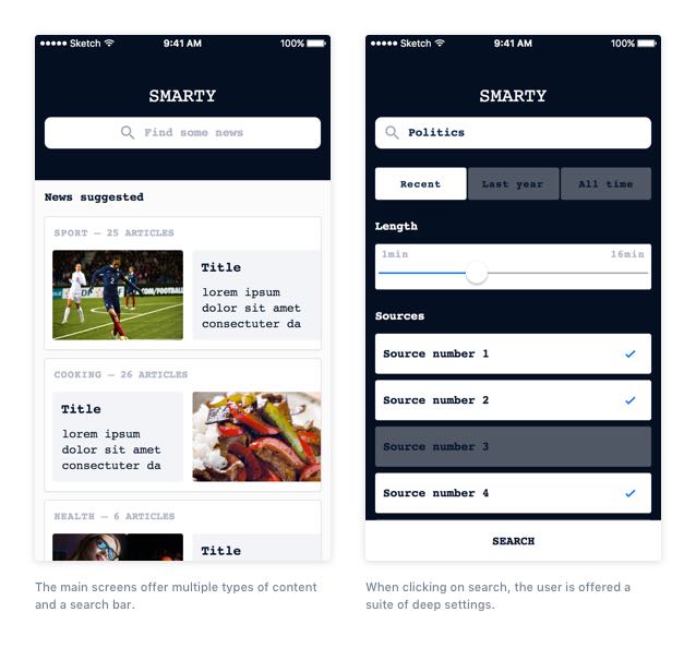
Main screens of the third concept: a card news feed.
On the third day, I played back my design process to the head of digital design. While we were exchanging thoughts and feedbacks, we evaluated the second concept as the strongest and decided to take it further.
We imagined the application to be the modern time paperboy.
The product would start with a preset of 3 deliveries per day, learn from the user’s interaction, then, start adjusting each burst of articles.
Our vision was to finally abstract the concept of deliveries and hit right 90% of the time to deliver the right amount of news, at the right time, in the right form.
For example, if a user read work-related content during breakfast for 15 minutes, we should be able to send a delivery of 15 minutes readable content ready for the user’s breakfast.
To capture the essence of the product, I wrote a set of design principles and made sure we kept those in mind during the next phases of design and development.
#1
Not creepy
The application should be transparent about its intention to the user. The customisation and contextualisation of the deliveries should be introduced in a friendly way.
#2
Content first
The aim is to provide adequate content before anything else. Delivering information and reading news should be the heart of the service.
#3
Stay in control
The delivery system we imagine should not cause frustration, we are building an open system in which users have the possibility to customise their experience.
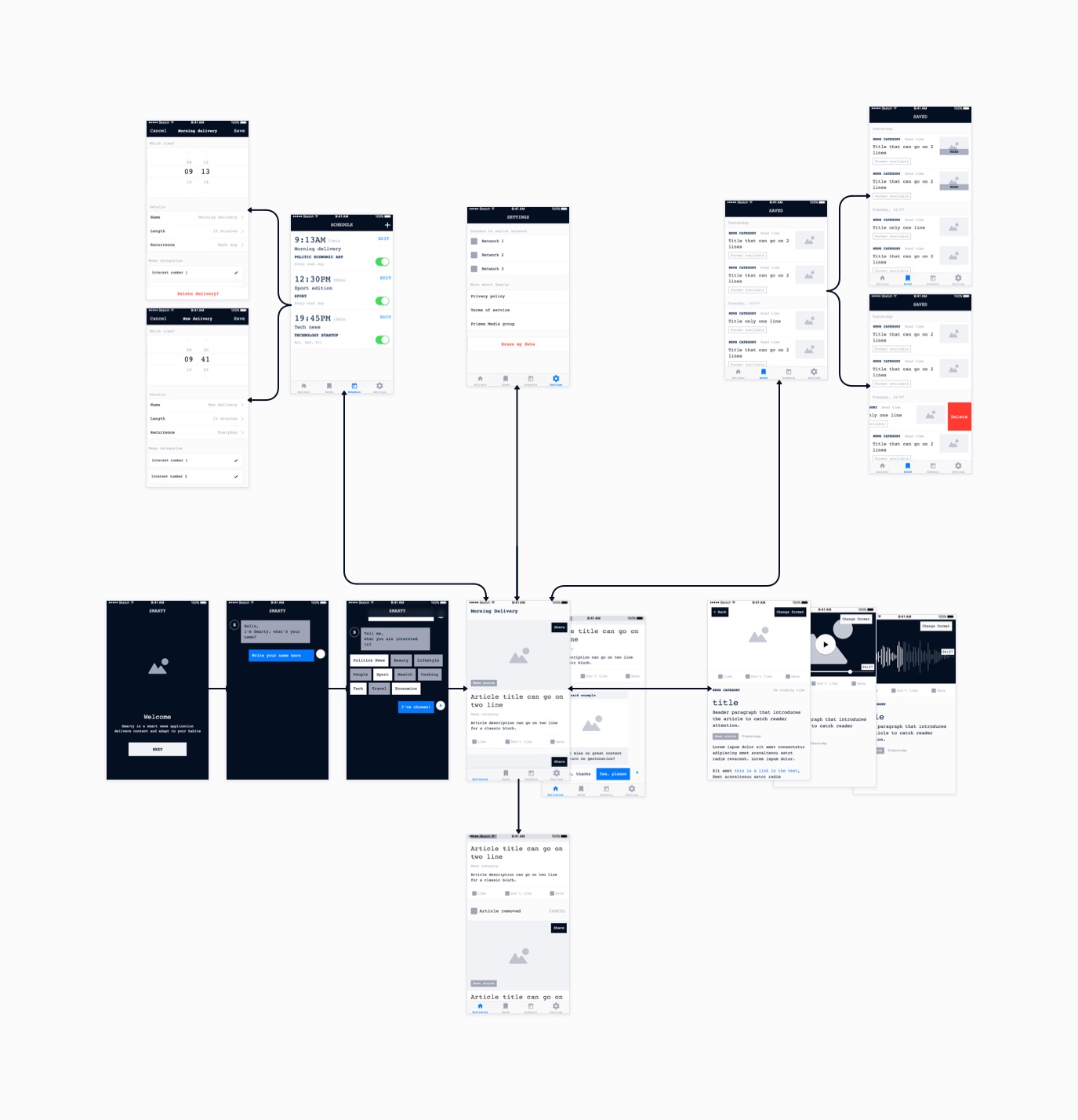
I created the first user flows and information architecture drawing the main screens on post it and interchanging their order to evaluate different stories.
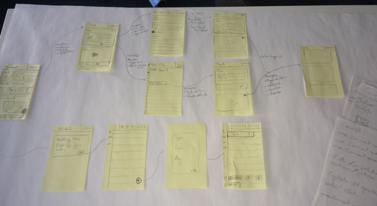
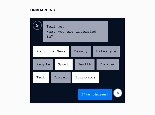
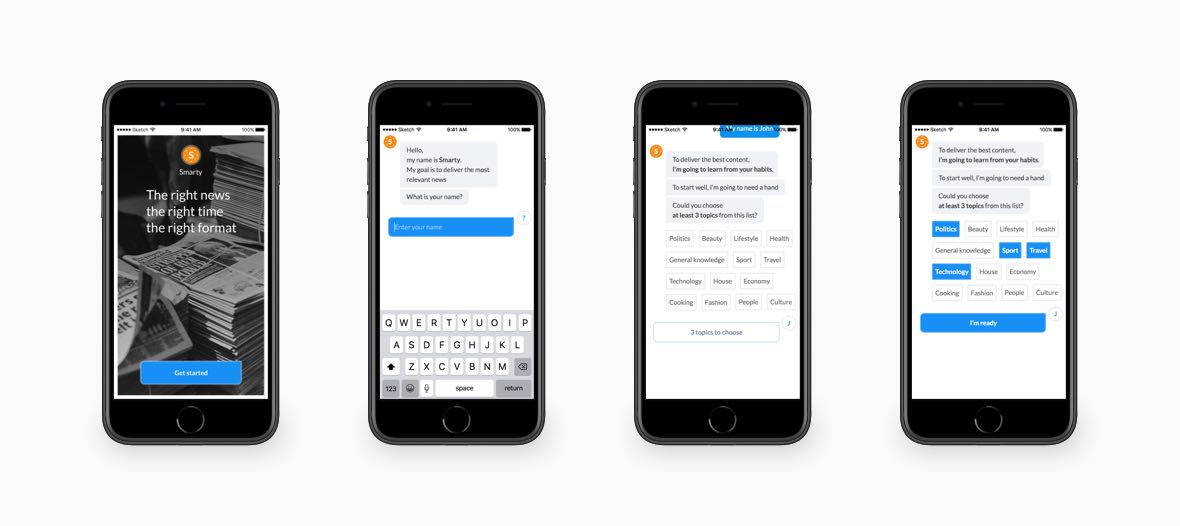
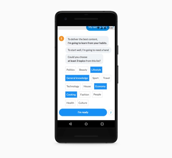
Given our impossibility to rely on any previous data, the hero story begin with a screen that prompt the user to select a few interests.
Then, the user land on the application home screen where the first delivery is presented.
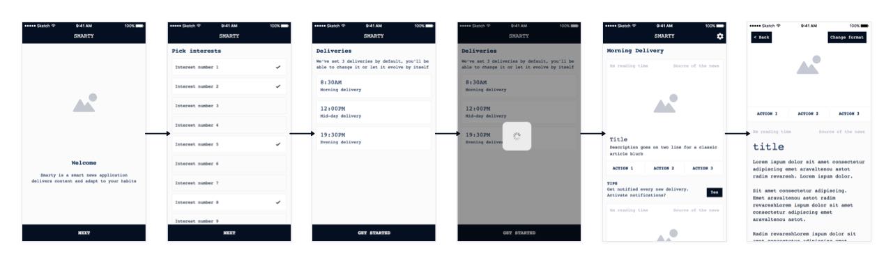
Wireframe flow of the hero story. From the first launch to an article.
Finally, I represented every principal scenario of the application on a map to visualise the user journeys and establish the backbone of the application navigation.

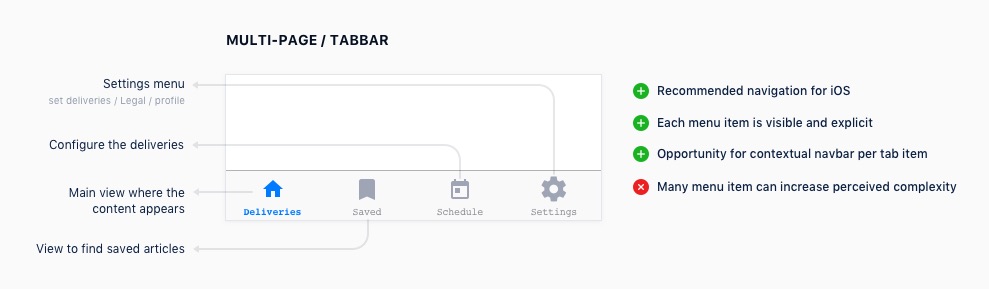
For the user experience to be the most intuitive and immersive, I compared the look and feel of a single page application versus a multi page application.
I created multiple Invision prototypes and run them through the member of our team to test the comprehension of the application.
The results pointed in favour of the multi page application, comforting the idea that a tab bar was the right pattern to use.
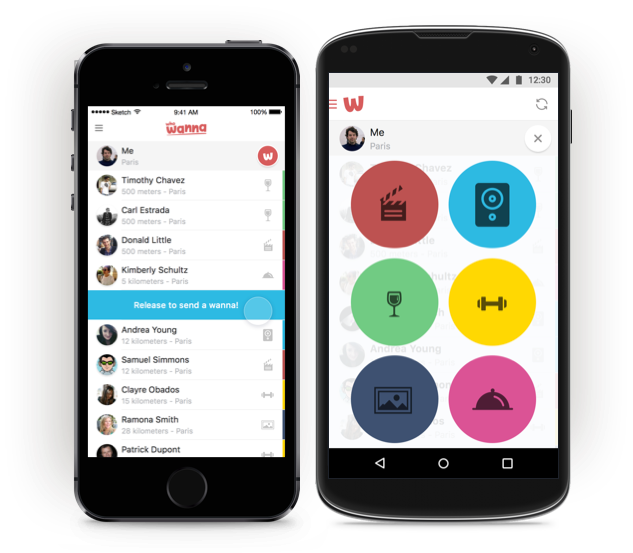
One of our design principle was all about giving a friendly aspect to smart technology.
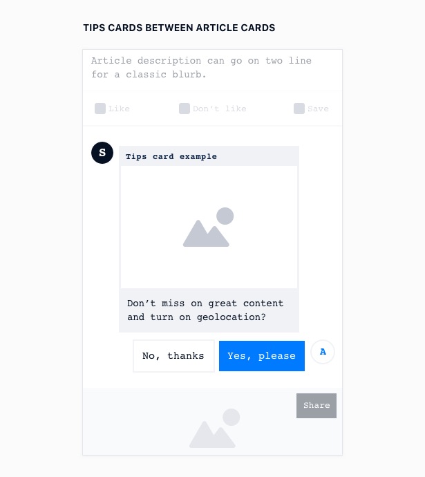
Re-using the basis of a previous concept, we chose to personify the application as a chatbot.
I used this UI concept whenever the application needed to communicate to the end user: during the on-boarding and in-between the article cards, as ‘tips’ or settings action.
The main flow and ui components decided, I assembled everything into one single product flow.
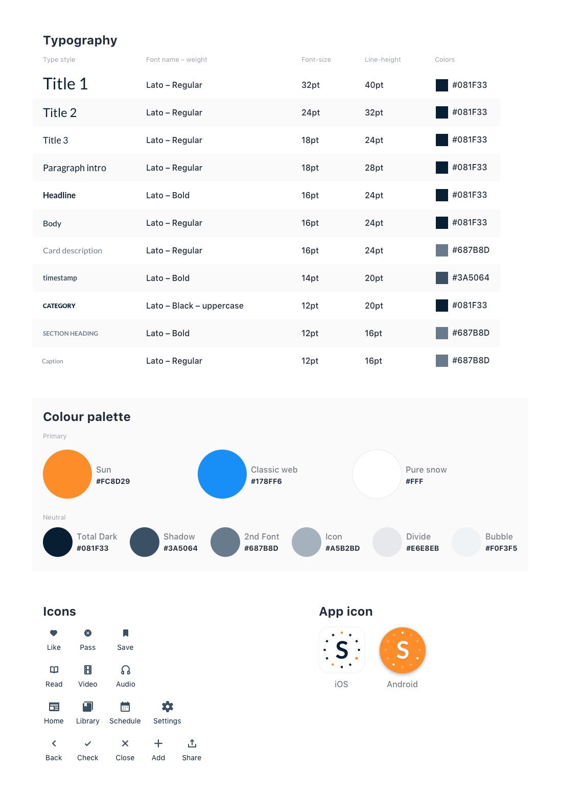
In order to create a common visual language across the entire application, the first step was to lay out every typographic element present in the flows and proceed to group them to be able to create the right type scale.
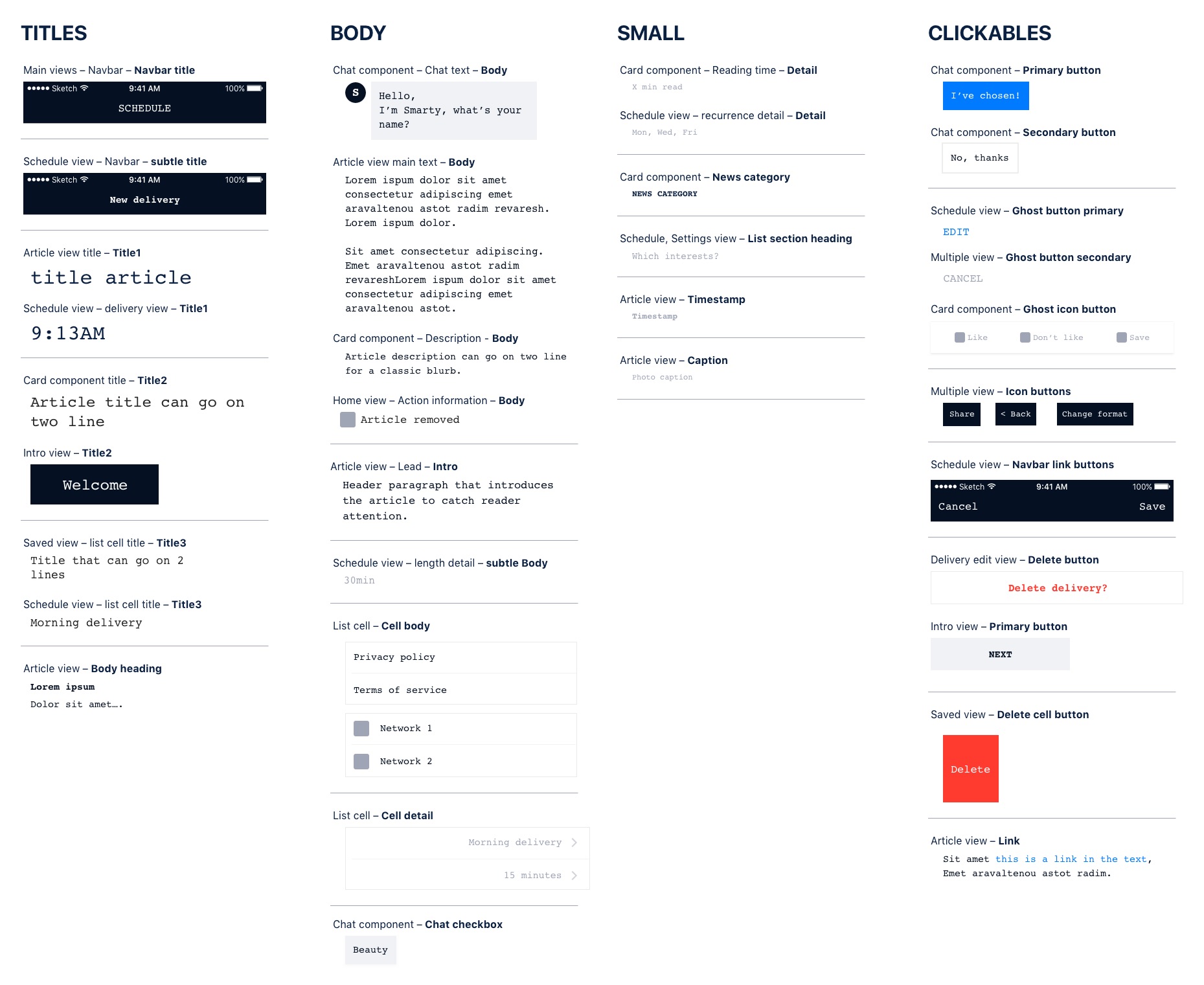
Categorised table of every text style used in the wireframes.
The design team decided to use Lato as main font-family, given its good legibility for body size but also nice and original character when used as titles.
As for the colors, we wanted the application to feel rather warm and landed with a strong orange as the dominant brand color and a complementary blue that would work well for UI elements.
Finally, re-using the same blue, we created a neutral palette.
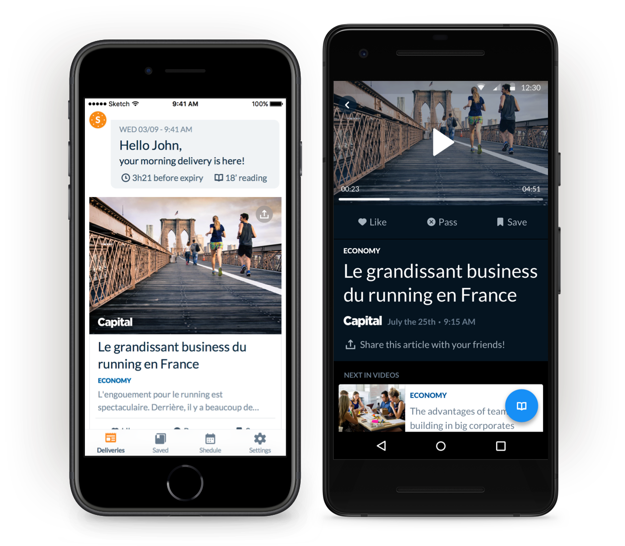
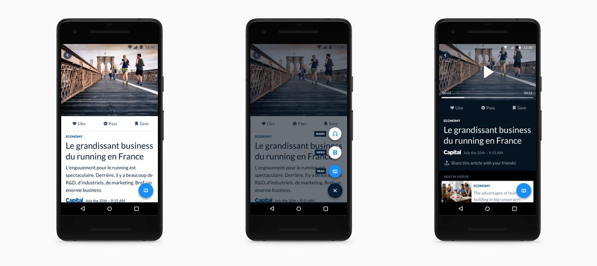
Multiple times a day, Smarty delivers a customised series of articles based on your reading habits. Each delivery is limited in time until a fresh one arrive.
Match your context with 3 format: audio, video, written. Listen to your deliveries like a radio, watch them like a news report or read like a newspaper.
No time to read this article or just want to keep it close to you? Just save any article to your bookmarks before they disappear from your delivery.
During this project, I had the chance to own most of the process and be a direct leader of the vision of the application the team had in mind. On top of working on the design side, I was given the chance to work on the product management side, collaborating with the lead engineer to handle the sprints. Finally, I was able to partner very closely with the mobile engineering team to understand the platform’s constraints and design feasible screens.
My main regret during this two months was being quite isolated from the future customer meaning that a lot of decisions we had to take relied on intuition. However, the application did went on a month of intense user testing before the first release, while I was not in the company anymore.
Social tool that help friends share some time together – The first startup I launched.
Read case study